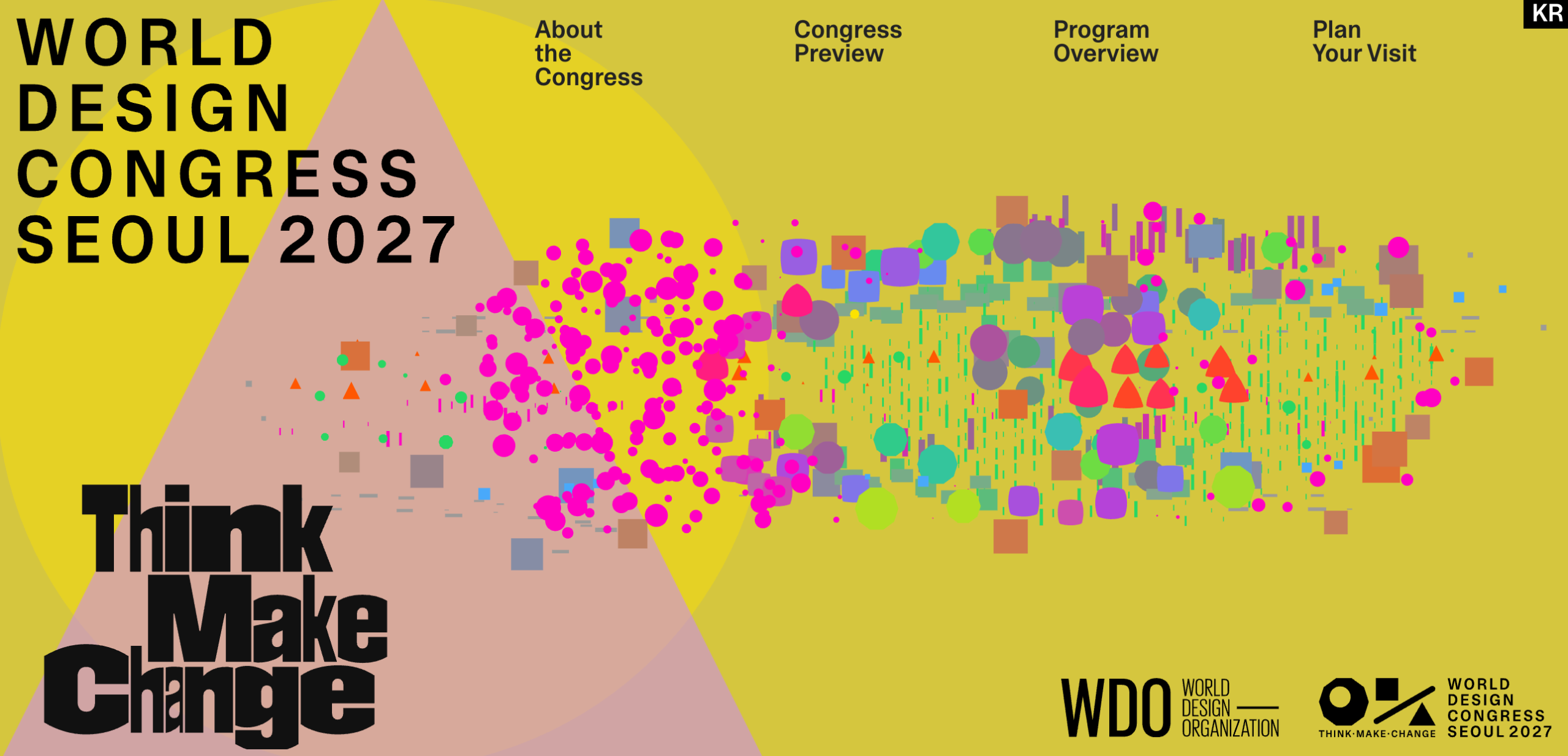
Seoul 2027 World Design Congress unveils bold new visual identity
The 2027 World Design Congress in Seoul has launched a striking brand that departs from tradition, using vibrant colors and a scattered logo. The design, built around seven colors tied to city landmarks, shows that boldness can be intentional.
The World Design Congress (WDC), held every two years in different cities, introduced its new visual identity for the 2027 edition in Seoul, South Korea. Designed by Everyday Practice, the identity is now fully live on the congress website.
The new look features clashing colors and scattered shapes animated in motion graphics. The logo resembles a seesaw in motion, set against a backdrop of bright hues. Unlike previous identities that rely on a single color and typeface, this design is unmistakably different.
The designers framed Seoul as a city of contrasts—ancient palaces beside glass towers, modest villages next to neon‑lit nightlife. Each of the seven colors represents a specific aspect: green for parks, blue for the Han River, orange for sunsets, and other hues for the city’s nightlife.
This project demonstrates that daring design can be grounded in logic and purpose. Rather than chaotic, the identity is built on a generative, scattered system that remains consistent across applications—from the website to pastel posters.
For designers, the example shows that it is possible to create loud, distinctive identities for respected institutions without abandoning design fundamentals. In the coming months, the identity will roll out across all congress materials and may influence how future design conferences approach their branding.