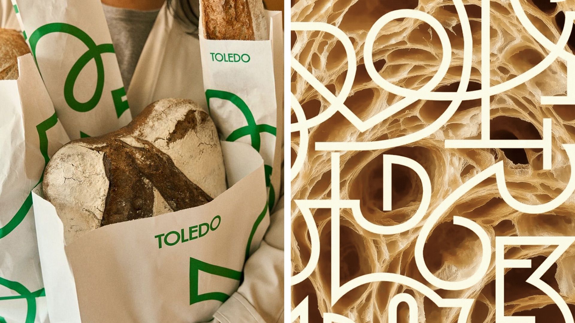
Toledo bakery rebrands, drawing inspiration from dough’s airy pockets
Montreal bakery Toledo, in partnership with Nouvelle Idée, unveiled a new logo and visual style based on the irregular air pockets found in laminated dough.
The redesign began with a search for a clear, memorable mark. Designers looked at the uneven air pockets that form in layered dough and turned those shapes into a graphic motif. These organic forms enabled a flexible visual system that can be applied to packaging, signage and interior décor. The result is a logo and assets that work across many contexts. A contemporary sans‑serif wordmark pairs with ornamental details, while a warm colour palette—evoking flour, butter, coffee and fresh bread—creates a sense of tradition and freshness. The project shows how product shapes can inform brand identity. For designers, animators and builders, it offers a concrete example of turning natural forms into a cohesive visual language. Going forward, Toledo will roll out the new look in its stores, on packaging and online. Creatives in design, motion and architecture can watch how this approach translates into real‑world applications.